2025 in Charts: How the Markets & Economy Performed
-Economic Indicators-
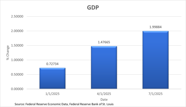
GDP
The GDP chart shows quarterly %change rising across the first three quarters of 2025. The data for the last quarter of 2025 has yet to be released. The series starts around 0.7% in Q1, increases to roughly 1.5% in Q2, and reaches about 2.0% by Q3. The trend is positive, indicating an acceleration in growth through mid-year.
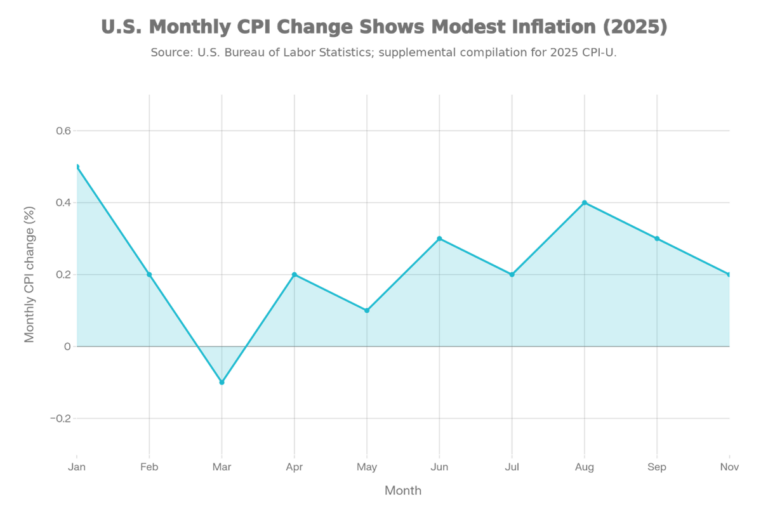
The inflation chart plots monthly CPI changes and shows generally modest inflation with one brief dip below zero. It starts strong in January (~0.5%), cools into March (around -0.1%), and then returns to positive prints through the middle of the year. Inflation firms again into late summer with a local high around August (~0.4%). By the last plotted month, the pace moderates back toward roughly 0.2%.
Inflation
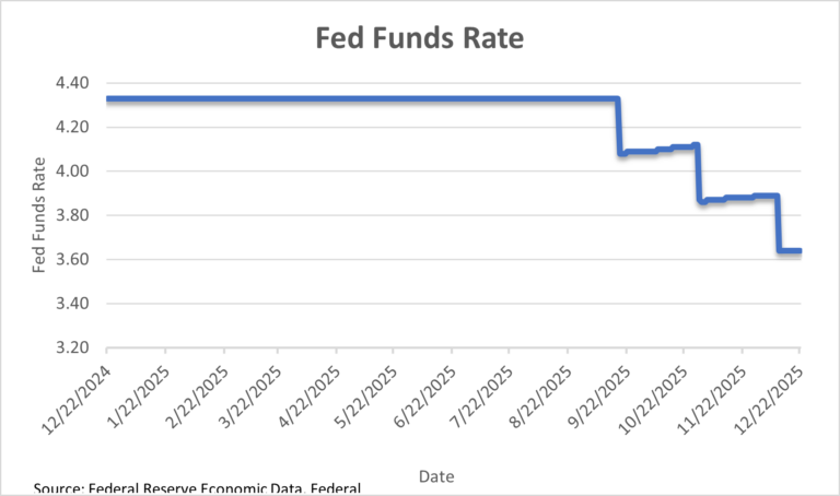
Fed Funds
The Fed Funds chart shows a flat policy rate early in the year, followed by step declines later in 2025. Rates begin around the low to mid 4% range and remain steady for much of the timeline. The meaningful move occurs in late Q3/Q4, when the rate drops toward the mid 3% area. The year ends with rate adjustments that are consistent with an easing cycle late in the year.
-Major U.S. Indexes-
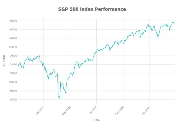
S&P
The S&P 500 chart shows a sharp drawdown early in 2025, followed by a strong recovery and new highs into year-end. The index begins near 13,000, falls to a low around 11,000 in the spring, and then reverses higher. From mid-year onward, the trend is steadily upward with only brief pullbacks. The year ends near the top of the range, around 16,400, signaling a strong back half.
Dow
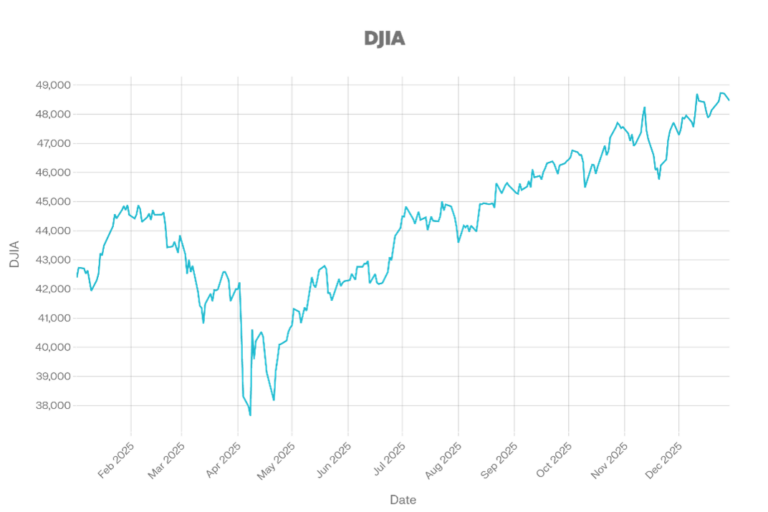
The DJIA chart shows early weakness, a spring low, and a sustained rally into year end. It starts around 43k, drops to roughly 38k in April, then rebounds. From summer through December, the DJIA trends higher, though volatility is exceptionally high in the fall. The index finishes near 49k, close to the chart’s highs.
NASDAQ
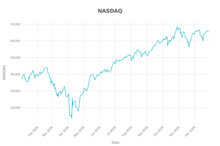
The NASDAQ chart shows the deepest spring drawdown among the major indices shown, followed by a robust recovery into late 2025. It begins around 26k, drops to roughly 21k in April, then climbs steadily. The uptrend accelerates into the fall, peaking near 31.5k around November. The year ends slightly below peak but still near 31k, reflecting strong overall performance after the spring selloff.
Russell2000
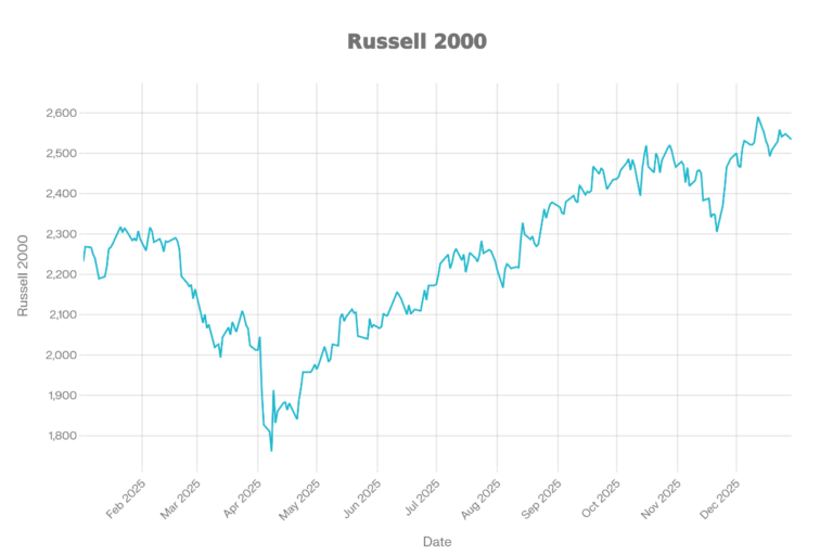
The Russell 2000 chart shows small caps under pressure early in the year, then recovering strongly in the second half. It starts near 2,250, bottoms around 1,775 in April, and then trends higher. The recovery is steady through summer and fall, with a brief pullback before resuming its upward trajectory. The chart ends around 2,550, near the top of the yearly range.
VIX
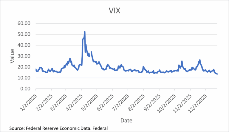
The VIX chart is dominated by a significant volatility spike in early April, followed by normalization. The index starts in the high teens, surges above 50 at the peak, and then falls rapidly back down. Through the rest of the year, VIX mostly stays in the teens with smaller spikes into the mid-20s in the fall. The chart ends near the low teens, indicating calmer conditions at year-end compared with the April shock.
-Bonds Market-
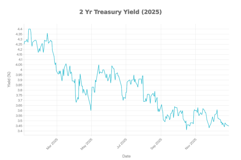
2Y Treasury Yield
The 2-year Treasury yield chart shows a clear downtrend over 2025, with the highest levels early in the year and the lowest levels late in the year. Yields start in the low 4% range and decline in waves through spring and summer. The lowest area appears in the fall around the mid-3% range, followed by only a modest rebound. The year ends near the lows, consistent with markets pricing easing and/or softer growth expectations.
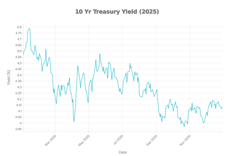
10Y Treasury Yield
The 10-year Treasury yield chart shows a choppy year, with a mid-year rise and a rebound into year-end. Yields begin around the mid 4% range, decline into spring, and then climb again into early mid-summer. A sharp drop occurs around early fall, after which yields stabilize and partially recover. The year ends around the low 4% range, below the early year highs.
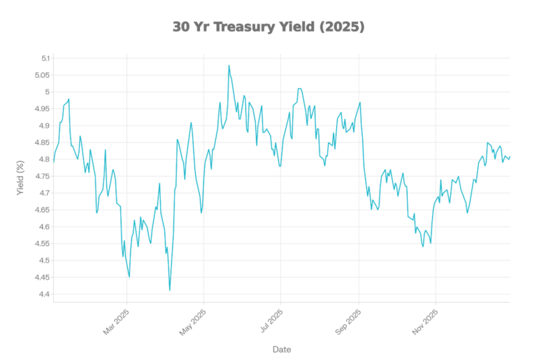
30Y Treasury Yield
The 30-year Treasury yield chart is volatile but broadly range-bound, with a spring low, a late spring early summer high, and a lower late-year zone. Yields dip into the mid 4% area in spring, then spike above 5% around late spring early summer. After mid year, yields trend down into the mid to upper 4% range before stabilizing. The chart ends around the upper 4%, below the year’s peak.
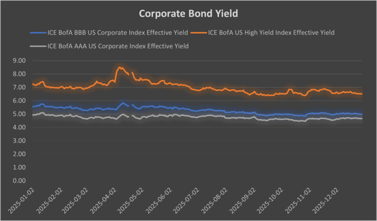
Corporate Bonds
The corporate bond yield chart compares multiple credit tiers and shows yields generally drifting lower into year-end, with lower-quality credit remaining more volatile. Higher-grade corporate yields (AAA/BBB) move within a tighter band, while high yield swings more sharply. All series peak earlier in the year and finish below their highs, signaling easing financing conditions versus peak stress points. The persistent spread between investment-grade and high yield bonds highlights that credit risk remained priced throughout the year, even as yields declined.
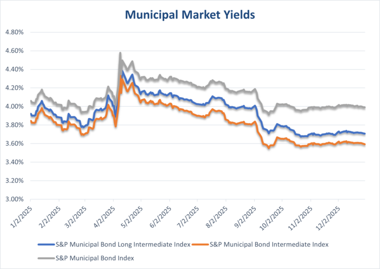
Municipal
The municipal yield chart shows multiple muni indices moving together, with yields peaking earlier in the year and easing into year-end. The lines rise toward a spring/early-summer high and then trend lower afterward. By late 2025, yields are closer to their lows than their highs, indicating improving muni market conditions (from a yield perspective). Differences between the muni series are present but modest, with the overall direction dominated by broader rate moves.
-Crypto Market-
Bitcoin
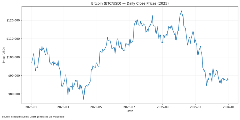
The Bitcoin chart shows a volatile year with a spring drawdown, a powerful summer rally, and a sharp selloff into late 2025. Prices start around $90k, fall into the $70k/$80k range in March and April, and then surge above $110k by summer. The peak occurs in the fall around $125k, followed by a steep decline into November. The year ends closer to $88k, well below the peak but above the spring lows.
Ethereum
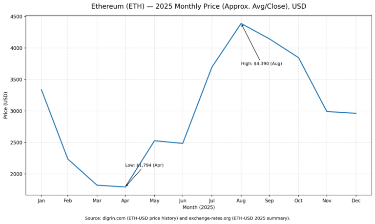
The Ethereum chart shows a sharp decline in the first half, a strong summer breakout, and then a decline lasting several months into the end of 2025. ETH begins around $3,300, bottoms near $1,800 in April, and then rebounds sharply. The high is around $4,390 in August, then trends down through the fall. By December, ETH settles near $3,000, above the lows but far below the summer peak.
-Commodities-
GOLD
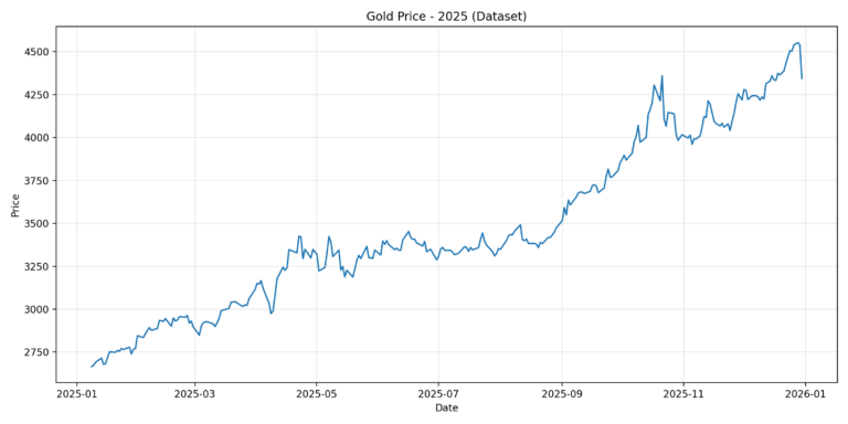
The gold chart shows a steady, persistent uptrend across 2025 with a notable acceleration in early fall. Prices begin around $2,700/oz and climb gradually through mid-year. A step change higher occurs around September & October, lifting the level into the $4,000+ zone. The year ends near the highs around $4,400/oz, consistent with a strong precious metals rally.
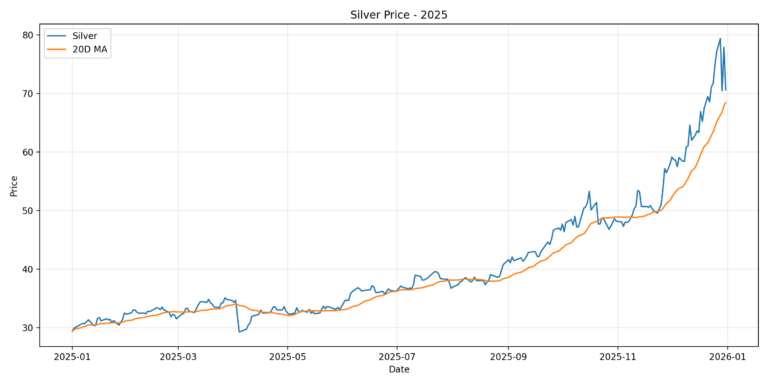
Silver
Lorem ipsum dolor sit amet, consectetur adipiscing elit. Ut elit tellus, luctus nec ullamcorper mattis, pulvinar dapibus leo.
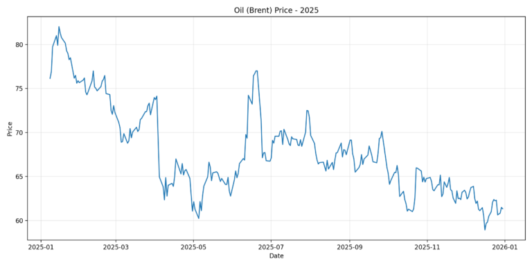
Brent Crude Oil
Lorem ipsum dolor sit amet, consectetur adipiscing elit. Ut elit tellus, luctus nec ullamcorper mattis, pulvinar dapibus leo.
Last updated 01/09/2026 (AI-assisted in the creation of this post): By John Benjamin
Like this:
LikeLoading...
Discover more from
Subscribe to get the latest posts sent to your email.